Painting with graphite pencil and eraser
22 August 2016 / Workshops
Before we started our exercise this morning we talked about the different grading of pencils and what the letter and number printed at the end of the pencil actually tell us.
The letter B denotes a soft lead. The higher the corresponding number next to the B gets, the softer and darker the lines will be. The softness is graded from B to B10 with B10 being the softest available, producing a dark and soft line.
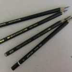
At the other end of the spectrum, H designates leads with higher clay content from H to H10. The higher the number gets, the harder the leads becomes, those producing a lighter and sharper line.
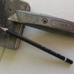
We also practised the sharpening of our pencils with a Stanley knife and smoothing it off with a sanding block t achieve a long sharp graphite end.
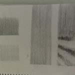
The first exercise was to produce harmonious shades of grey with pencils of different grades of softness, before starting on our black and white pencil painting.
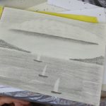
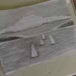
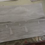
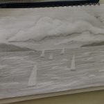
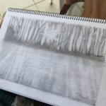
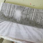
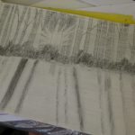
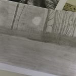
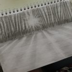
The group was divided in two groups, one that worked on a seascape and the other on a negative forest landscape. Both groups began to cover the whole page with two shades of grey divided at the horizon line.
The seascape group worked first on the sky and removed the cloud shapes with an eraser. The boats were created by drawing sail shape silhouettes with the eraser on the lower part of the grey scale. The landmasses were shaded in later and the waves were created again with the eraser.
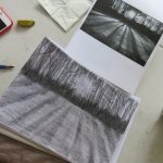
The forest group had to reverse their thinking as the trees in the forest were grey shapes untouched by the eraser, while the shape in between the trees was created by taking graphite out with the eraser. This has caused some confusion at first as we were tempted to draw the trees with the eraser.
We also realised that there are many things to consider when choosing the right eraser. A good eraser should lift graphite with the lightest of touches without smudging or smearing. It should be sharp enough to erase fine lines and no matter how much you rub, the paper should stay hole-less.
We also noticed that the paper we use plays an important fact in the quality of the drawings. Smoother paper was easier to blend and rougher paper left some unwanted marks on our drawings. Also the layout of the paper was discussed when deciding to use it in ‘landscape’ or ‘portrait’ layout.
All in all it was a short but very informative session for everyone.


Leave a comment
Your email address will not be published. Required fields are marked*